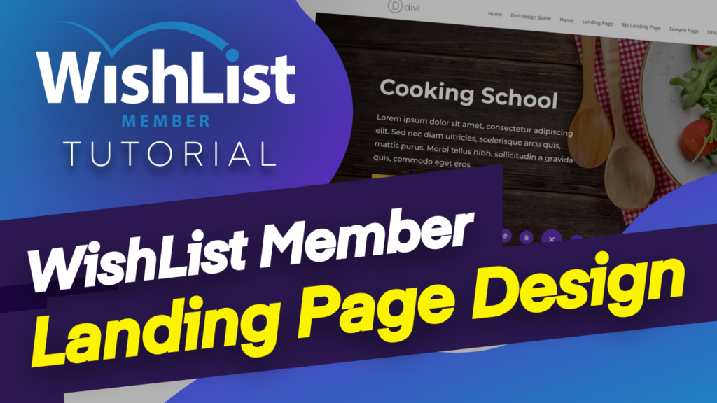
Hello everyone, and welcome. In today's video, I'm going to show you how to create a landing page using Divi's premade layouts.
So let's dove in and let me show you how to do that. So over here, I'm in my WordPress admin dashboard. So the first thing we need to do is to download the images that we need for our website. So, of course, the different types of membership websites. So you need to decide what your membership website is and then download the images that you need.
So I use a few relative free websites. So let's head over here and take a look at some of the sites that I use. So the first one here is Pixabay, this is really good. All the images here are royalty-free, which means you can use them as much as you want without any licensing issues. All right. So let's say our membership website is about cooking so we can just search for cooking images here and then choose the image that works with this design.
So I want to go with this one here, because I like the fact that over here I have a space where I can add my call to action and a brief description of what my website is about. So this is what you need to do to choose the right images for your website. So I'm going to go ahead and click this and download the right size. So I'm going to come over here. You can see it says Free Download. Now, the size that I normally go with for my hero images is 1920×1280.
So I'm going to go ahead and download it and then just click download, OK? I also need to look for other images that complement this. So I'm just going to come over here and see what else I can use so I may want to use some of these for my background. So I'm going to go with it, see what works here. All right. Let's go with this one here. So I've downloaded. OK, so these are the two main images that I'm going to use for my site.
So now back over here to our main website, we need to go to “Media” and click on “Add New”. So now we just need to add those two images to come over here to “Choose file”. And in my downloads, these are the two images from the open that upload and I'm going to add the other one. OK, so these are the two images that I need for my website. Now let's go ahead and create the landing page for our membership site.
OK, so now it's a matter of just adding a brand new page. I'm going to click here and “Add New.” Now I'm just gonna call my page “Landing one.” But of course, this could work as your main landing page. So it's up to you how you're going to have this. You can have people point to a specific landing page or you can have it as the main page of your website. So let's just call this “Landing One”. All right. So now I'm going to go ahead and click on “Use Divi Builder.”
All right. So for this design, I'm not going to build from scratch because I need to save a lot of time. So I'm going to click here where it says, “Choose a premade layout.” And we have a lot of premade layouts here. So you can see here all these designs are amazing. Now, I want to tell you something very important here. A lot of times when people look at these premade layouts, they're looking at them for that specific function.
But what people don't realize is you can pretty much use any premade layout here. All you have to do is to change the content. And this will work fine. So that's what we're going to do here. So as you can see here, we have all these different layouts. So I will just go ahead and choose whatever layout that I need for my landing page and then use that as the main page. So I'm going to browse through here and see if something catches my eye.
I like this one here. In fact, this is food recipes. This could actually work very well. So, in fact, let's just go ahead and use this one here. So I'm going to click on “Use This Layout.” So what's going to happen now is all the elements of this page are going to be loaded onto my page. And then all I have to do is to go in, and change the design, change the colors and change the contents that's on this page.
So it's very, very easy to use and very easy to set up. Now, when it comes to the loading time here, it depends with the internet connection, but usually it's pretty fast. OK, so it looks like everything is going well. And I have this checkmark now. So the page will refresh and show you everything on this page. So as you can see here, we have different elements for our page. So now let's start working on our site.
All right. So the first thing we need to do here is to go into my section settings here, go to background so we can see here. This is where they added the image. So we want to add our own image. So what you need to do is to click on the image tab, delete this one here, and then click on the plus button. And now we need to find our image that we added earlier on. So I'm going to scroll down here and this is the one, “Upload an image.”
And now you can see our image has been added and it looks beautiful. All right. So now that we have this, I'm going to save that. Next, we need to go in and customize this information here and make it ours. So let's start here with this top part. OK, so this we're going to rename this to our website. So I'm going to say “Cooking School.” There we go. And then here, I'm just gonna leave this text as it is.
But I want to show you something quickly here in case you want to use different fonts for your design. So I want to go to the to the design tab and making sure I click here on this brush tool. It's gonna take me to my Heading 1 here so I can change this font now to something that I, you know, that I really like. And I'm going to go with Montserrat and there you go. You can see that this now has changed and this is how you update your landing page element.
All right. So with that, I'm going to save I'm going to also come here to the paragraph text, click on design text, and then I'm going to go ahead and change this as well. Now, I can see here the size is a bit too big, I can just, you know, drag it down a bit to about 22 and save now a featured recipe here. I really don't need this. So another way to work with this is to go ahead and delete what you don't need so much and highlight over here and then delete it like that.
Now you can see it's gone and this is how you customize an already created premade layout with Divi. All right. So now I'm going to work on this button here. So I'm going to click here on this gear icon and let's work on the colors. So here on the button, you can see “Use custom styles for button” is already activated. So all I have to do now is to come over here and change my colors. So I've changed my color here.
And I also need to do the same to the border. And now you can see my color has changed. But you know a way to make this. I don't really like that color. So I'm going to change my text color here to white. And I'm also going to make it bold because I really want to stand out. So I'm going to come over here. And now you can see it's bold and I'm also going to increase the size and scroll back to the top here and adjust our size.
So we want our button nice and big. So we're going to go with 20 here. So I really like the way it's looking now. And these are minor tweaks that we can do to our design to make it look like our own design. So as you can see, I've saved a lot of time. I didn't have to come up with a layout that I need for this page. This is working really well for me. All right. So now I can save this.
Oh, in fact, you know what, I've said make this so we can change this text here to “Memberships. OK, so this call to action will take them to the memberships page. And over here on the link, this is where you can add your button URL to that main landing page, which has all the pricing options. All right. So now I'm going to save this. Now, moving on. You can see we have training recipes.
Now, to be honest, I don't really like this training recipes thing because this is a membership website. So it's nothing to do with training memberships. So what we need to do here is to talk about perhaps maybe the benefits of signing up for this membership. So let's transform this into the benefits. OK, so I'm going to come over here to the main title and I'm just going to rename this and call this “Benefits.” OK, let's change the font and come back over here.
And this is Heading 2 and I'm just going to choose Montserrat, and we're going to make it all caps and the size is a bit too big. Let's bring this down a little bit about, say, 24, and we're going to make this bold. And let's change the color as well, and we're going to add a bit of letter spacing too. There we go. So I really like sometimes when I'm deciding to use letter spacing. Right. So now that I have this, I'm going to change to bold.
And now that's looking really, really nice. OK, so I'm going to save that. And now it's time to change this content over here. So I'm going to replace this with blurbs. So let's see here. So here this is a blurb. But of course, the way it's structured is not how ideally I would like to have this. So let's not use our Lorem text. So I want to search for Lorem 2. So I really like using this because this gives me my dummy text that I need to use for my site.
So now I'm going to replace this like that. And so this is where your benefit one would go. OK. And for our text here, we might need to go in and customize a little bit. Now, over here you can either have an image or you can have an icon. So it's up to you how you want to design this. But normally I would go with icons. So I'm going to come over here to image an icon and “Activate” use icon.
So here now I can choose the icon that I need for benefit one. So maybe. I can go with that. Now, let me stylize this and make it look the way I want, so I'm going to start here with benefit one and this is heading three, as you can see. Let's change our font here to keep everything consistent. We're going to make it all caps. Actually, no. Right. Let's leave it like that. Change our color here and let's make it bold because we really want this to stand out.
OK, so benefit one. Now we need to adjust the paragraph text as well. So it's fine here as Monsterrat, but we need to increase the size a little bit. So let's go with that perhaps 16. Right. So, OK, I like 16, but now as I'm looking at this, I really don't like the way the size of the icon, so I may want to go in and make it slightly smaller. All right. So let's make adjustments to our icon here.
All right. So to make adjustments to our icon, we need to come over here and then you can either use a circle on the icon here. This is also quite cool. So let's try that and see how this looks. OK, so now this is our circle, and then we can also change the color of our icon that's inside that circle. And now I need to adjust the size. So here we go, icon font size.
We can reduce that a little bit to about, say, 30, and I'm happy with that, I'm going to save this. Now, I want to also save a lot of time here, redesigning this all the time here. So I'm going to delete this, delete the other one here and then just duplicate this a few times and drag this into position like that. And like that. OK, so now we have our benefits page all sorted. So next, I'm going to come over here and work on this little line.
So I'm going to come over here to design and change that line color and save. OK, so now we have our main hero, part of our website, and then over here we have the benefits of using the site. Now, don't forget, you need to come over here and change the icons themselves because, of course, you don't want this to be the same icon. So let's go with this one here. Save that. I'm going to change the other one.
Come to “Image” and “Icon” and this one here is going to be right, let's go with this camera here, OK, and save. All right. So moving on, here is a part where we can have a bit more information about the course itself. So let's go in and make a few adjustments here as well. So I'm going to use some Lorem text here just to save me a lot of time. So I'm just going to copy the heading parts.
Then I'm going to come over here to design and I'm going to target this text here and this is H2 and I notice that I'm using this brush tool. It's very, very handy. So I'm going to come over here and change to Montserrat and look how beautiful that looks. Now, next, I'm going to come over here to paragraph text. Same, I'm going to change this to Montserrat and the size. I may want to reduce this a little bit, maybe 18 or better.
OK, and then finally, we have this button here. And for consistency sake, I'm going to change the button color here, as we did before. And now that looks much better. And all I have to do now is make this font bold. Great. So now this part here is looking, OK, I'm going to save this and let's find out where that image is. OK, so I've just deleted the image, so now we can go ahead and save. Now this stock pics we don't really need that, so all we have to do is to delete it.
And here we have a call to action. So, again, we can decide to either have it or maybe even remove it altogether. So I'm going to keep it. But let me just delete what else I don't need here. So this here can go. And the newsletter. Do we really need the newsletter? I don't think so. So let's delete the newsletter as well. OK, great. So now let's just work on this and pretty much we're almost done.
So I'm going to go in here now and change this background image. Now, remember, we downloaded two images. So now it's time to find our other image, which is this one right here, upload an image. But what are we going to do now is we're going to do something slightly different here. We don't really want this image really showing like that. So let's add an effect to this. So I'm going to come over here “Add whites” come back to the image and we are going to add a blending mode.
Which is called “Lighton,” and then all we have to do now is to go back over here to our image and drag the slider down just to reveal that image in the background just ever so slightly, just like that. Right. I think that looks great. Now I'm going to save this. And then all I have to do now is to come over here and make adjustments to this call to action. So let me start here with this title.
So next, I'm going to come over here to design and I'm going to target this and change my font to Montserrat, reduce the size a little bit because it's a bit too much. There we go, so I'll go with 26 and I'm also going to change the color here, maybe go with a much darker color like that and then save. And then next need to target this paragraph text here and also change the text to Montserrat. So go ahead and select that and reduce the size as well.
There we go. I think that's that's looking very nice now. Finally, I need to work on the button here so I can just go over here to the button and click here on my module settings and I can leave it as “Learn More” but you can change it to whatever you want. And also you have your link here. I'm just gonna add a blank one. And now it's time to go to “Design Button” and let's change our colors one more time.
So our button text is going to be white, so it stands out on the background. And then over here I just need to change. The colors of the button and make it bold, so over here, I'm going to change this to Bold and now you can see that this is looking really, really nice. OK, so all I have to do now is to save and pretty much we all have our landing page for our cooking membership website.
So as you can see, this was a really straightforward to do. I know this could take a bit of time, but surely if you were to start this from scratch, you would spend even more time. So as you can see, I didn't need to worry about all the mobile views, because if we take a look at this website, everything is all optimized because of the premade layout. So let's switch over here and see what it looks like on a mobile device.
As you can see here, everything is in place, it's laid out correctly. And this works beautifully on pretty much any type of screen. So let's go over here to the phone. And again, if I scroll back here to the phone, you can see everything is nice. It's easy to read and it is great on all mobile devices. So this layout design here can be used pretty much on any type of website. So I'm going to have this available for you to download and use.
But be aware that this only works with Divi, so it only works with Divi. You do need to have Divi installed for you to use this premade layout. All right, guys, that's all I have for you in today's video. Thank you very much for watching. And I'll see you in the next video. Take care.
